SELF-INITIATED CONCEPT
Apex, in perspective
A visual language for a new chapter of Apex.
01 / The design question
A point of departure.
How could the warmth and geometry in the original Apex archive become a coherent visual system for a contemporary independent studio?
02 / The direction
A coherent perspective.
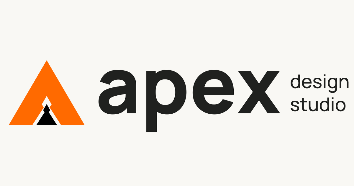
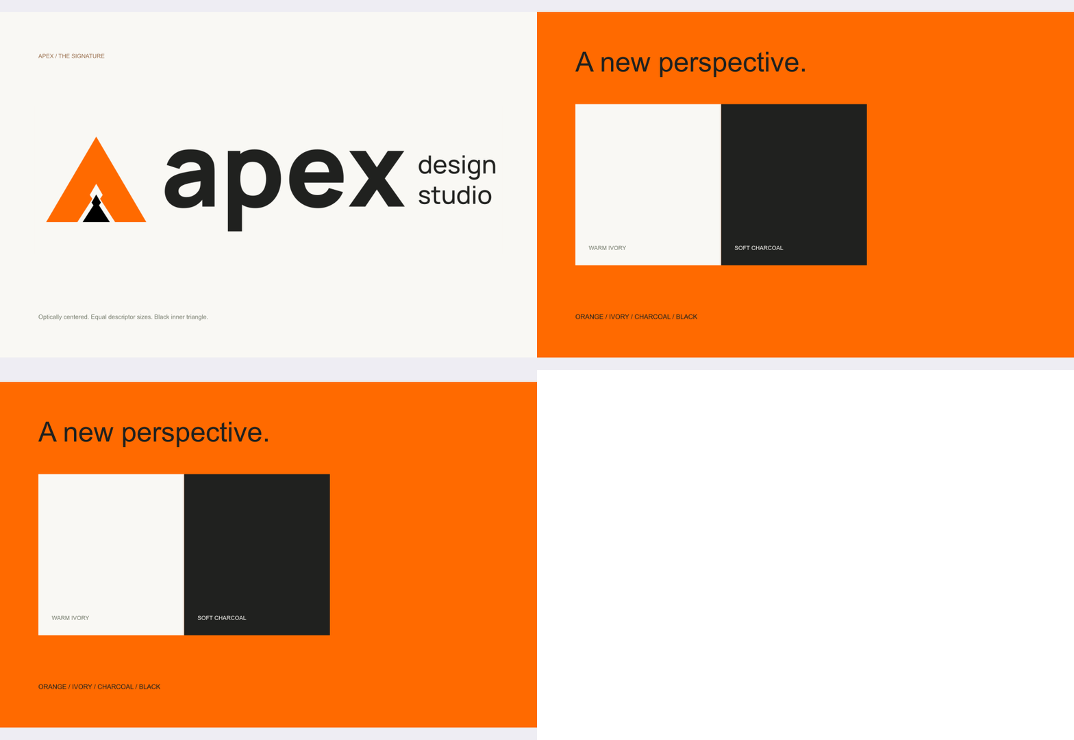
The filled triangular A restores the angular notches from the original Apex mark. Orange carries energy, ivory makes room for the work and charcoal gives the system a clear foundation. Typography connects digital layouts to editorial applications.
APEX / VISUAL EXPLORATION
Your next move.
Starts with design.
03 / The applications
A system you can build on.
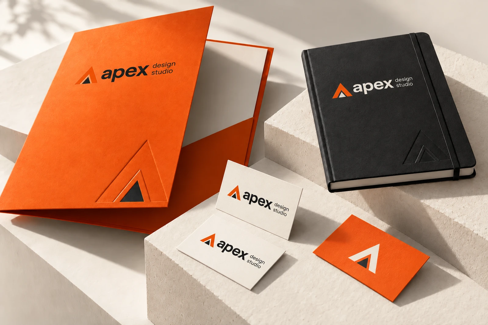
An identity study with a vector mark, typographic compositions, an editorial poster, a social format and card layouts. The physical stationery scene is an AI-assisted concept mockup, not a photograph of a produced print run.
Download the editable studies ↓SVG mark, card layouts, editorial poster and social artwork. Concept sources, not a prepress-certified print package.
Animated exploration
See the idea in motion.
An animated illustration of the prototype states and brand applications. This is a storyboard, not a screen recording.
Keep exploring